About myself
Hi! Im Andre, and welcome to my website! I am an aspiring Data Scientist, and am fascinated by the things we can do with data. From machine learning to beautiful interactive visualizations, the analysis of data really helps us understand the world from a different perspective. Here, I will showcase some interesting projects that I’ve worked on, either for work, for school assignments, or just out of curiosity.
Projects
WorldBank Shiny
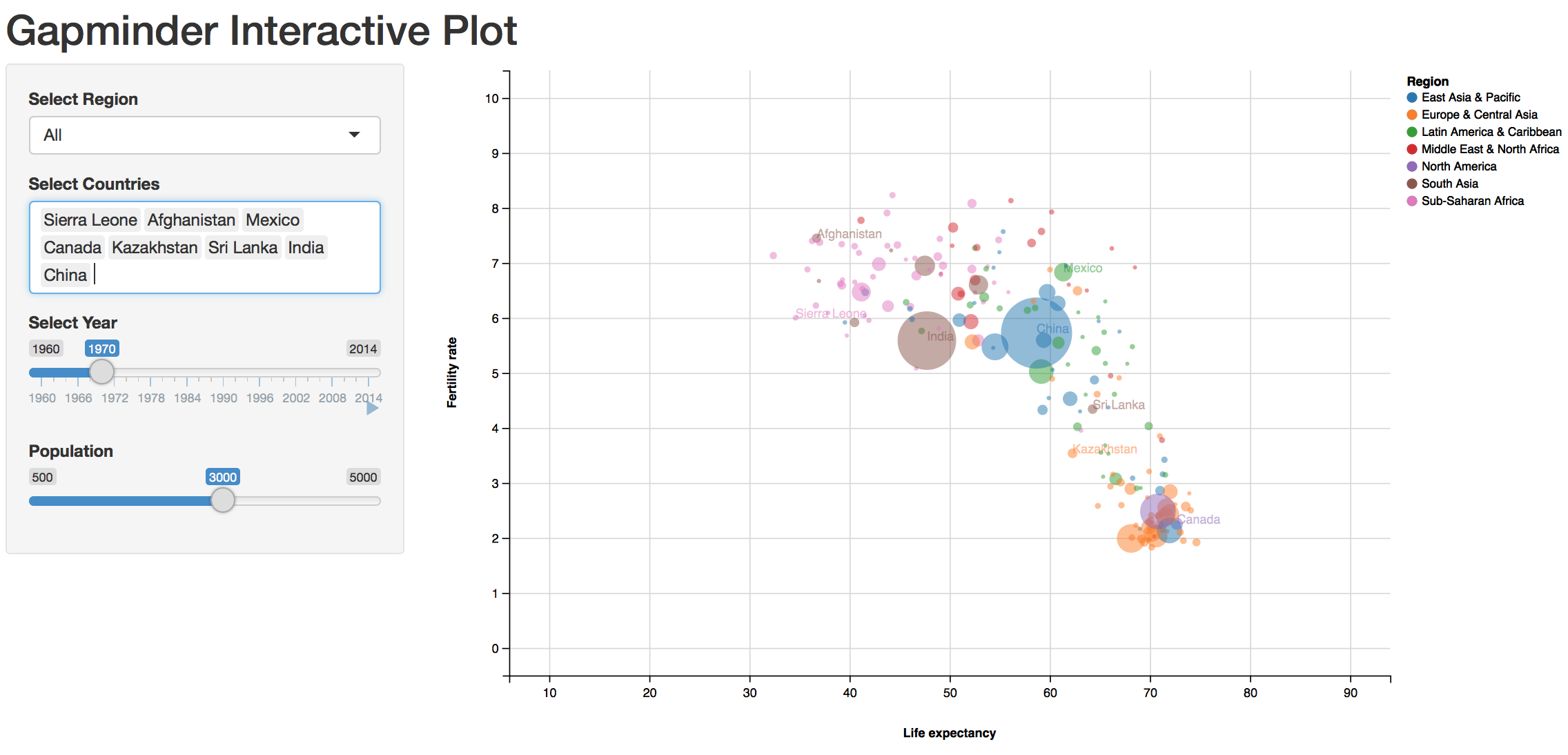
This is an R Shiny app that I created for my Data Visualization course at USFCA. You can try out the deployed app here (there is some server lag when using the app online. However, running it locally should work pretty seamlessly).
The World Bank provides a lot of data for all countries between 1960 and 2015, such as Life Expectancy, Fertility Rate, Population, and many others. In this project, I chose those three variables in order to build an R Shiny app that plots the Fertility Rate vs Life Expectancy throughout the years. Each country is a single point that moves through the plot with time, and the size of the point is proportional to the total population for that country. My goal was to reproduce this interactive graph from Google. The result is fairly close, and I’m happy how it turned out.
Firefox Crash Graphs
This is a project I worked for while at Mozilla. You can take a look at the deployed website here.
Firefox Crash Graphs is a daily (weekdays) report of crash analysis on a representative 1% sample of the population from Firefox’s release channel on desktop. Main, content, and plugin crashes are collected and analyzed for this sample of the population and provide an accurate representation of the state of Firefox experience for desktop users and can be used by developers to improve it.
For this project, data was analyzed in Spark (PySpark and SparkSQL) using Jupyter Notebook on a 16-node AWS cluster. The graphs were made using the metrics-graphics javascript library.
Wiki-Walk
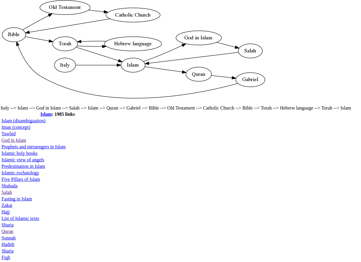
This is a Python project I worked on for my Data Acquisition course at USFCA with three other students. The final output is a Flask app that runs locally (although it is easily deployable on a server as well).
This project displays the degrees of separation between topics on Wikipedia. This interactive program allows users to visually see the shortest path between two topics. Users can select a start and end term from a dropdown menu, and the program will take them on the shortest journey between these topics through an automated process that clicks on the relevant Wikipedia links.
Due to data storage limits and potentially long run-times, the program was implemented on a fully connected subset of articles, rather than all of Wikipedia. However, given more resources, the program can be easily scaled up to get the degrees of separation between any two topics on Wikipedia.
Alongside Flask, we used BeautifulSoup to parse the HTML pages from Wikipedia (obtained through GET requests) and Selenium to create the visual journey that guides the user through the shortest path between two articles.
DAU Calendar
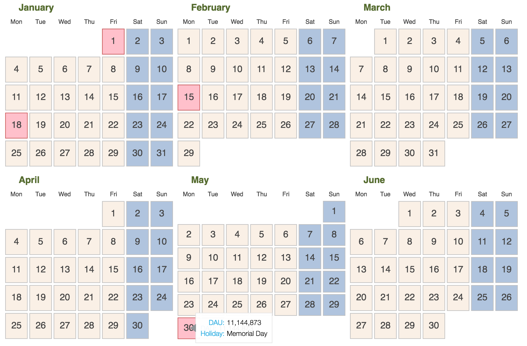
This is a simple Bokeh Python app I created as a proof of concept. DAU stands for Daily Active Users, i.e., how many distinct users are active on your product on a given day. This metrics is widely used throughout companies, and is usually visualized as a time series. This is just another visualization, where a calendar is built with that information and shows DAU (and any other useful information) when the user hovers on any date. In this example, I also colored weekends and holidays to show some possibilities.
Another fun idea that could be built on top of this current version is to have the size of the day (either the number or the entire square block) increase or decrease according to the DAU, so days that saw more users active would immediately stand out from within the calendar.